Schedule a call.
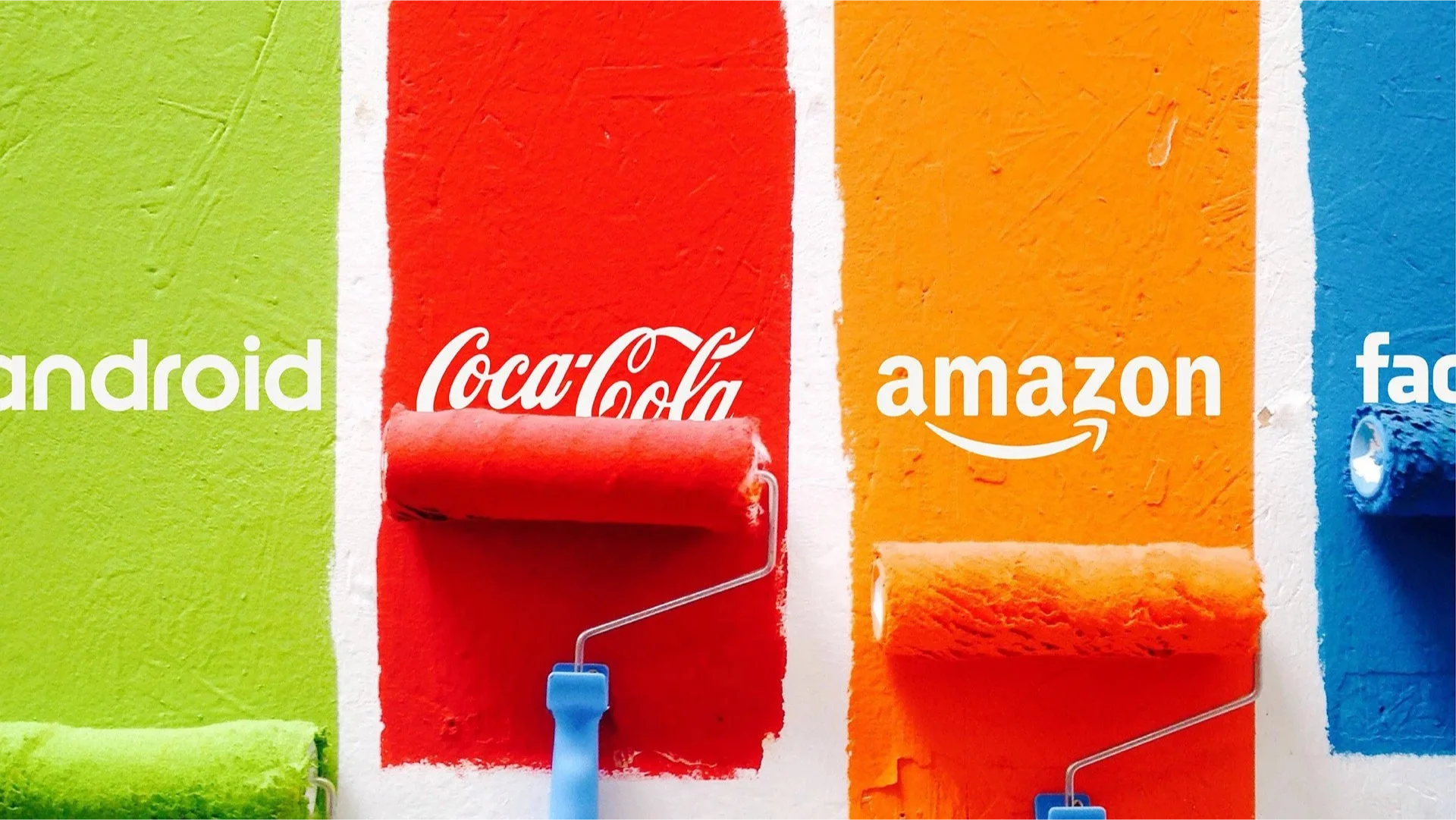
In the vast canvas of branding, colors play a pivotal role in defining a brand’s identity and influencing consumer perceptions. While many companies stick to traditional colors associated with their industry, some daring brands break the mold with unconventional color choices. This blog explores the fascinating world of unusual color choices in branding, with a spotlight on big Indian companies that have boldly stepped away from the norm to make a statement.
"Colors are the smiles of nature." – Leigh Hunt
The Psychological Impact
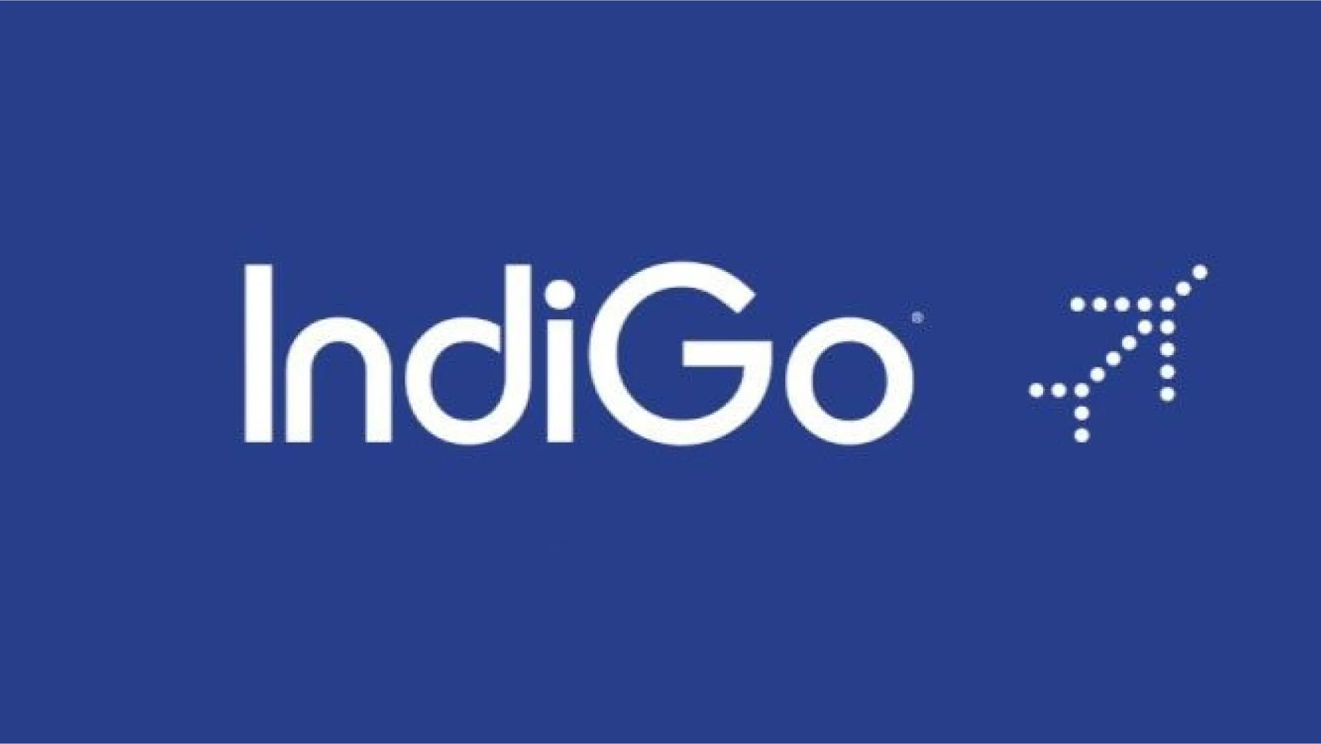
Colors not only enhance brand recognition by up to 80% but also deeply influence emotions and behaviors. Take, for instance, the Indian airline IndiGo. In an industry dominated by reds and blues symbolizing dynamism and reliability, IndiGo chose a deep indigo color. This choice not only reflects the brand's name but also stands out for its calmness and sophistication, setting IndiGo apart in the crowded skies.
Brand Differentiation
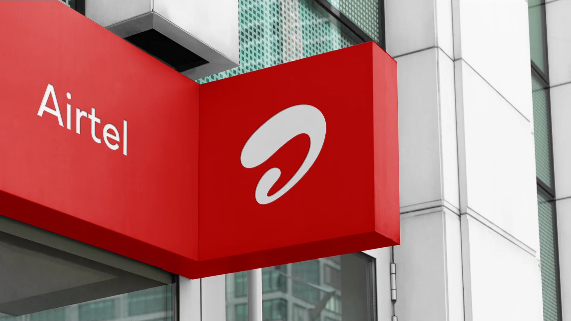
In the competitive market, differentiation is key, and color can be a powerful ally. Airtel, one of India's leading telecommunications companies, uses a bright red in its logo and branding. Red is a bold choice, representing passion, energy, and action. In a sector where trust and reliability are paramount, Airtel’s red evokes a sense of confidence and leadership, distinguishing it from competitors.
Cultural Significance
Understanding the cultural context of color is crucial for branding. Tata, one of India’s largest conglomerates, utilizes a deep blue across its various companies, from Tata Steel to Tata Consultancy Services. In Indian culture, blue is associated with depth, stability, and trustworthiness, reflecting Tata's values and its storied history in India's industrial landscape.
Success Stories and Cautionary Tales
The path to picking an unusual color is fraught with challenges and opportunities. Flipkart, India's e-commerce giant, chose yellow and blue for its branding, a combination that evokes accessibility, friendliness, and trustworthiness. This color choice has played a significant role in Flipkart’s branding strategy, making it visually appealing and easily recognizable among Indian consumers.
Conclusion
For brands, the best color is the one that truly represents their identity and values. Indian companies like IndiGo, Airtel, Tata, and Flipkart teach us that stepping out of the color comfort zone can create distinctive identities and emotional connections with consumers. Their success stories are a testament to the power of unconventional color choices in branding.
"The best color in the whole world is the one that looks good on you." – Coco Chanel
In crafting your brand’s visual identity, consider the emotional, cultural, and psychological impact of color. Don’t be afraid to experiment with unusual combinations or shades. It might just be the key to setting your brand apart in the competitive market landscape.